There are plenty of ways to present collections of data on the screen to users, with one of the most common layout pattern being a good old-fashioned grid. In UIKit grids are built with a combination of a collection view and its layout object.
In this article, I’ll be covering how to create and apply the grid layout to a collection view in UIKit. This article won’t be covering how to create collection views and feed data to them. If you’d like to learn more about how to connect data to collection views and provide cell views for it, then feel free to check out my article How to Use Diffable Data Source in UIKit.
Without further ado, let’s begin.
What’s Compositional Layout
In UIKit, collection views are built with the UICollectionView type. Each data entry in a collection view is displayed within a cell. The cells are arranged by the collection view with the help of a layout object, represented as a subclass of the UICollectionViewLayout class. The layout object is data agnostic, meaning that it doesn’t have any access to the data in the cells whatsoever. The only responsibility of UICollectionViewLayout is to arrange the cells and set spacing between them.
While you could theoretically subclass UICollectionViewLayout to create custom layouts (e.g., arranging items in a circle), most common layouts can be achieved more easily with UIKit’s UICollectionViewCompositionalLayout. The UICollectionViewCompositionalLayout class, itself a subclass of UICollectionViewLayout, is used to compose layouts out of progressively smaller components—sections, groups, and items—much like the layers of a Russian doll fitting one within another.

The smallest component is an item, which represents a single cell in the collection view. Items are then arranged into groups, groups into sections, which in turn make up the layout. Thus, to create a UICollectionViewCompositionalLayout you’ll need to:
- Create items
- Arrange items in a group
- Create section with the group
- Create and apply the layout using the section
This workflow is the same regardless of the layout you want to create. The changes between layouts are expressed in values you pass when composing a layout, but the methodology is the same.
In this guide I’ll show you how to create a simple grid layout using the UICollectionViewCompositionalLayout.

I. Create Items
Being the smallest part of the compositional layout, items are defined with the NSCollectionLayoutItem type. Each item sets the size and the spacing of a single cell in the collection view.
The size of an item in compositional layout is expressed with an instance of NSCollectionLayoutSize that takes a pair of NSCollectionLayoutDimension dimensions to set the width and height of the item. The NSCollectionLayoutDimension type comes with a bunch of convenient type methods for creating size objects easily, which we’ll be using throughout the article.
To create an instance of the NSCollectionLayoutItem pass in the NSCollectionLayoutSize in its init(layoutSize:) initializer. In case of a grid layout, I find it useful to set the size of an item to a fraction of the width or height of the group that contains the item. For example, to create resizable square grid item set both width and height to a fraction of group’s width using the fractionalWidth(_:) method:
// One third of the group’s width.
let itemDimension = NSCollectionLayoutDimension.fractionalWidth(1.0 / 3.0)

// Item’s width and height are the same to create a square.
let itemSize = NSCollectionLayoutSize(widthDimension: itemDimension, heightDimension: itemDimension)

// Initialize item by passing in the item size.
let item = NSCollectionLayoutItem(layoutSize: itemSize)

Item Spacing
Once you create an instance of the NSCollectionLayoutItem, you can access its contentInsets and edgeSpacing properties that you can use to set the spacing inside and outside of the item respectively.
let inset: CGFloat = 10

// Add spacing INSIDE the item
item.contentInsets = NSDirectionalEdgeInsets(top: inset, leading: inset, bottom: inset, trailing: inset)

// Add spacing OUTSIDE the item
item.edgeSpacing = .init(leading: .none, top: .none, trailing: .fixed(inset), bottom: .none)

contentInsets will shrink the items, while setting edgeSpacing will maintain the size of the item, but will push content around it.II. Arrange Items in a Group
In compositional layout, groups arrange the items in relation to each other and are described with the NSCollectionLayoutGroup type. When you create a group, you choose how the group will arrange the items—horizontally or vertically.
To create a group, call one of the type methods of the NSCollectionLayoutGroup, passing in the size and the items it should contain. For example, for grid layout, groups can arrange items horizontally taking the full width of the screen with fractionalWidth(_:) dimension and as much height as necessary to fit all the items with the use of the estimated(_:) height dimension.
// Full width
let groupWidth = NSCollectionLayoutDimension.fractionalWidth(1.0)

// The 100 points is an estimate. Actual height might be adjusted during render time to fit all items
let groupHeight = NSCollectionLayoutDimension.estimated(100)

// Create group size
let groupSize = NSCollectionLayoutSize(widthDimension: groupWidth, heightDimension: groupHeight)

// Create horizontal group with the items
let group = NSCollectionLayoutGroup.horizontal(layoutSize: groupSize, subitems: [item])
Grids with Nested Groups
The neat thing about the NSCollectionLayoutGroup type is that it’s a subclass of the NSCollectionLayoutItem class, enabling the use of nested groups. Simply pass a group as one of the items to another group and, voila, you got yourself a nested group.
// Large items take 70% of the main group's width and fill the group’s full height.
let largeItemSize = NSCollectionLayoutSize(widthDimension: .fractionalWidth(0.7), heightDimension: .fractionalHeight(1.0))
let largeItem = NSCollectionLayoutItem(layoutSize: largeItemSize)

// Small items fill full width of the nested group and half of its height to fit 2 items vertically.
let smallItemSize = NSCollectionLayoutSize(widthDimension: .fractionalWidth(1.0), heightDimension: .fractionalHeight(0.5))
let smallItem = NSCollectionLayoutItem(layoutSize: smallItemSize)

// Nested group takes the remaining 30% of the main group's width and arranges items vertically.
let nestedGroupSize = NSCollectionLayoutSize(widthDimension: .fractionalWidth(0.3), heightDimension: .fractionalHeight(1.0))
let nestedGroup = NSCollectionLayoutGroup.vertical(layoutSize: nestedGroupSize, subitems: [smallItem])

// Main group fills the screen horizontally and fits 3 main groups vertically
let mainGroupSize = NSCollectionLayoutSize(widthDimension: .fractionalWidth(1.0), heightDimension: .fractionalHeight(0.3))
let mainGroup = NSCollectionLayoutGroup.horizontal(layoutSize: mainGroupSize, subitems: [largeItem, nestedGroup])

Spacing Between Items in the Group
Groups enable you to set the spacing between items along the group’s orientation axis. To add spacing between items in a group, set the interItemSpacing property of the group to an instance of the NSCollectionLayoutSpacing type, which can be initialized using one of its type methods:
fixed(_:)— allows you to set fixed spacing between items, effectively shrinking items horizontally or vertically along the group’s direction;flexible(_:)— sets the spacing to or greater than the amount, filling the available space.
// Fixed spacing example
group.interItemSpacing = .fixed(10)

// Flexible spacing example
group.interItemSpacing = .flexible(10)

III. Create section with the Group
Sections divide compositional layout into distinct parts and are represented with the NSCollectionLayoutSection type. You create a section with a group, while the properties of the group define how the section displays the content, enabling independent item arrangements for different sections.
To create a section, pass your group in the init(group:) initializer of the NSCollectionLayoutSection type:
let section = NSCollectionLayoutSection(group: group)
Section Spacing
Once you create a section, you can configure the spacing inside the section and around it by setting the following properties:
interGroupSpacing— this property accepts a simpleCGFloatand sets the spacing between groups inside the section;contentInsets— analogous to the similar property in items, this property accepts an instance of theNSDirectionalEdgeInsetstype, allowing you to set the spacing separate for each side around the section.
// Spacing between groups
section.interGroupSpacing = 10.0

// Padding around section
section.contentInsets = NSDirectionalEdgeInsets(top: 10.0, leading: 20.0, bottom: 10.0, trailing: 20.0)

interGroupSpacing and the padding around the section as a whole with contentInsets.IV. Create and Apply Layout
Finally, with all the bits and pieces of the layout ready, it’s time to compose it. To create UICollectionViewCompositionalLayout use its init(section:) initializer, passing in the section you configured.
let layout = UICollectionViewCompositionalLayout(section: section)
To apply the layout to the collection view, assign your layout to the collectionViewLayout property of your view:
collectionView.collectionViewLayout = layout
In case you would like to apply different layouts during runtime with animations, for example in response to a device orientation change, you could call the setCollectionViewLayout(_:animated:) method on your collection view, passing in the desired layout:
collectionView.setCollectionViewLayout(layout, animated: true)
setCollectionViewLayout(_:animated:). You can check the implementation shown in this video in the sample project I created for this article on GitHub.Grid Layout for UICollectionViewController
Below is the complete code to configure a grid layout for a UICollectionViewController—simply call this function in the viewDidLoad of the view controller:
func configureGridLayout() {
    let spacing: CGFloat = 10
    let itemsPerRow: Int = 3

    // I. Create item.
    let itemDimension = NSCollectionLayoutDimension.fractionalWidth(1.0 / Double(itemsPerRow))
    let itemSize = NSCollectionLayoutSize(widthDimension: itemDimension, heightDimension: itemDimension)
    let item = NSCollectionLayoutItem(layoutSize: itemSize)

    // II. Create a group with the item.
    let groupSize = NSCollectionLayoutSize(widthDimension: .fractionalWidth(1.0), heightDimension: .estimated(10))
    let group = NSCollectionLayoutGroup.horizontal(layoutSize: groupSize, subitems: [item])
    group.interItemSpacing = .flexible(spacing)

    // III. Create section with the group
    let section = NSCollectionLayoutSection(group: group)
    section.interGroupSpacing = spacing
    section.contentInsets = NSDirectionalEdgeInsets(top: spacing / 2, leading: spacing, bottom: spacing / 2, trailing: spacing)

    // IV. Create and apply layout.
    let layout = UICollectionViewCompositionalLayout(section: section)
    collectionView.collectionViewLayout = layout
}
Changing itemsPerRow value in this code will set the amount of squares that fit in the group.
Wrap Up
Well, there you have it. In this guide we’ve covered how to create grid layouts using the UICollectionViewCompositionalLayout, but you can use this workflow to create any layout. You may also add headers and footers to sections and decorations to individual items using the NSCollectionLayoutSupplementaryItem class, however that’s worth another article on its own.
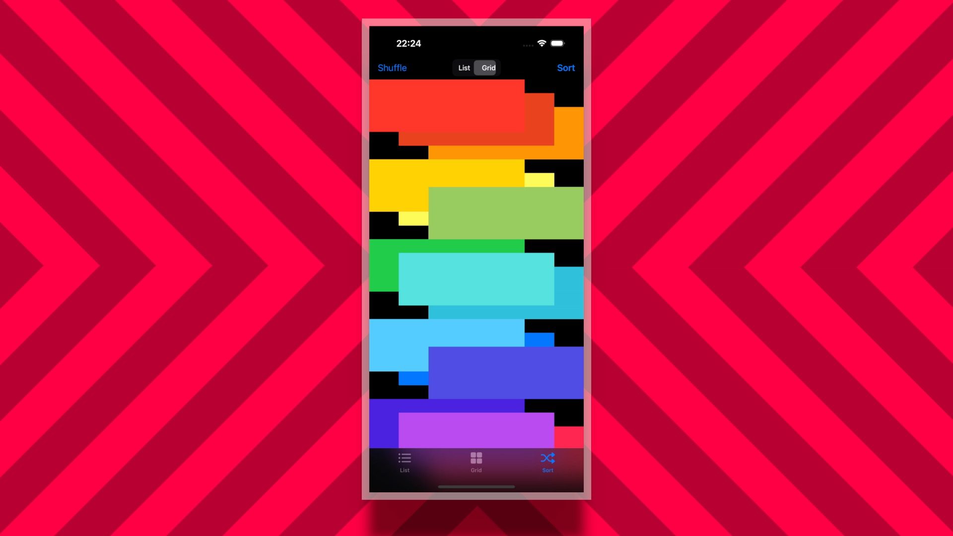
If you’d like to see the grid layout in action, then check out my Xcode sample project on GitHub where I implement grid layout with section headers.
I hope you found this guide useful. Happy composing!